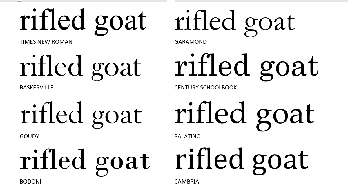
• Some letters are wide (w, m).
• Some are narrow (l, i).
• Some have buggy whips (f, r).
Letterspacing within words can get touchy, as when f lashes out at l. An r crowding an n may look like an m. An apostrophe after f looks like a sneeze in search of a kleenex.
See examples below. Times New Roman is a tightly bunched font. Century Schoolbook is wider and spacier but still has encroachment issues. In “wolf’ll,” the apostrophe is shamelessly snogging the f.
Palatino is clean and modest by comparison.
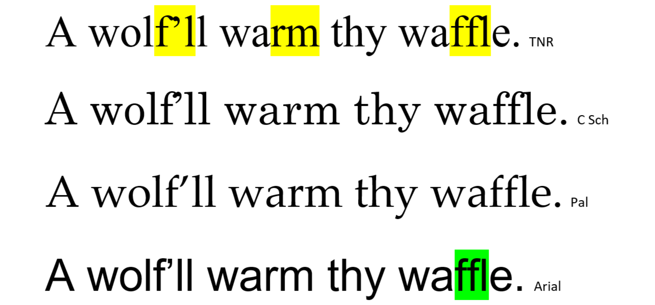
Arial and other clean-cut fonts are less prone to touchy overcrowding, partly because their letter strokes do without terminal blobs and beaks (serifs). Taking a close look at “waffle,” you see how pleased with itself Arial must be, not only keeping the f-crooks clear of each other but also joining the horizontals to form a double letter (ligature). That’s tight spacing.
Apostrophes in Close-up
Below are f-apostrophe examples in serif fonts (blobs, beaks, and pedestals).
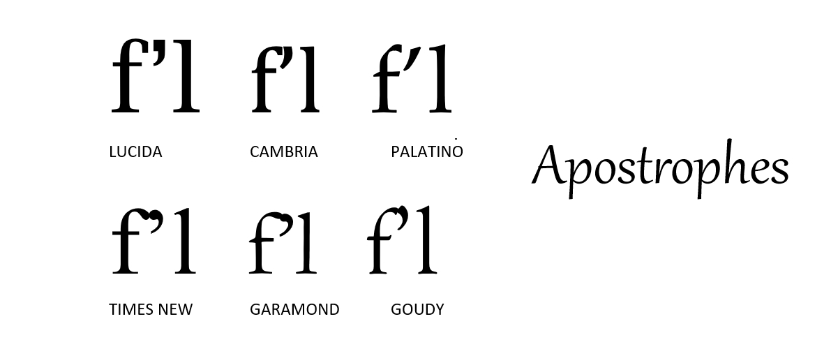
Lucida has its square-head apostrophe centered perfectly, as you would expect in a font from the bit-mapped 1980s. Palatino solves spacing by redesigning the apostrophe, from a yin shape to a semi-bananoid.
Under the f-Blob
The f-blobs in Lucida and Cambria are like kitchen faucets aiming downward. The Cambria r is going to get wet. Square dots over the i’s date these as pixel-era fonts.
Palatino and Goudy scream hand-lettered.

Palatino’s f rises thick, angles thin, then thickens again to a squared-off, forward-looking stop: thinning or thickening at turns is characteristic of a pen with an angled nib (chisel-tip).
In the Goudy f, the thinning is more fluid, suggesting a brush stroke. You can always identify Goudy by the letter i, dotted with a diamond.
The f in Times New Roman droops nearly on top of the r . That is TIGHT letter-spacing, valued highly in narrow-columned newspapers but less so in books.
Baskerville is a grandfather of TNR. Both have heavy blobs, which may improve readability by making thin strokes more visible. Thin strokes are much thinner in Baskerville.
Topknots and g-Bags
The letters g and y are “below the baseline” cousins to f and r, encroaching on neighbors’ space. Why does y slant backward? Why does this kind of g have a lasso below? Short answer: these are the forms inherited from medieval manuscript tradition. The first fonts were designed for readers who were accustomed to monkish handwriting.
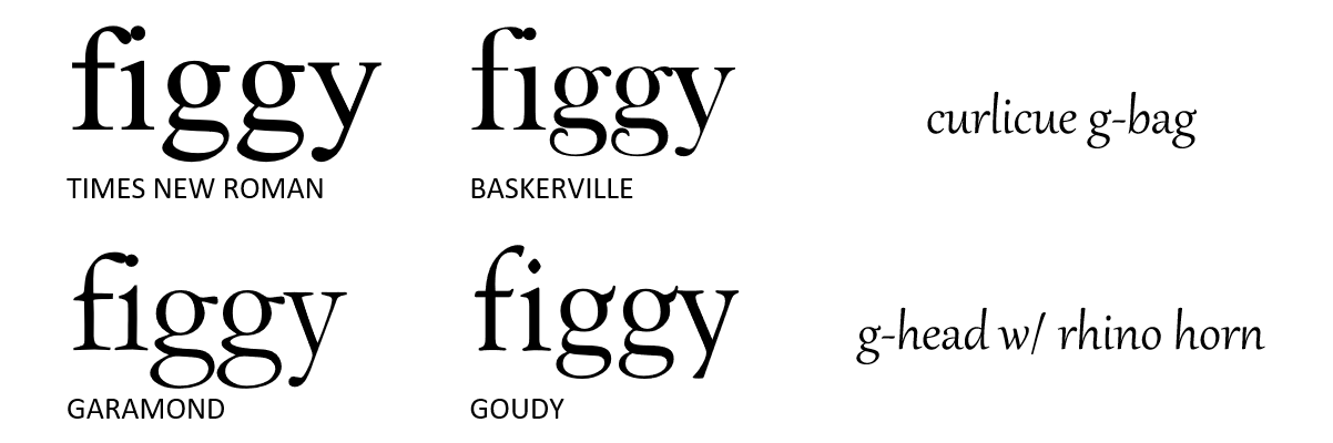
The Baskerville g features a curlicued oval, which is not quite closed. The serif on its g-head is like the topknot on a quail, bowing courteously.
Both Garamond and TNR set their serifs low enough on the g-head, like the bill of a ballcap, to avoid the y-serif. Goudy’s rhino-like g-serif damn-near stabs the y.
The Un-round O
The letter o is seldom a circle. It may be a perfect circle in typewriter-born Courier, but it’s an obvious oval in Arial — a font so standardized every stroke of every letter is of uniform thickness. It is surprising then to find one of the TNR-like fonts (Gar, C Sch, Bodoni) has a circular o. Hint: the one with the droopiest a-bag.

Notice the white pill shape inside the o in C Sch and Bodoni. The pills are upright. Notice how the pill in TNR is tilted slightly leftward. Is it because monks were mostly right-handed? Notice also in TNR that d and b, which ought to be mirror images, are not. Though TNR’s middle name is New, there’s much of the Middle Ages still in it.
Read On
You’d never finish a book if you noticed irregularities in every letter of every word. So we surf lines of type without regard to the droplets flying in every wave. No doubt the future of fonts — and language generally — will bring further simplification and modularity. Yet the smoothest surface, under magnification, always turns out to be a jungle gym of atoms, with long molecules swirling in a vortex of association and connection, toward the eye of madness — or further study and enjoyment. To that end, here is an array of examples for contemplation at your leisure.